Building Sorry World's Design System
- Role
- Lead Game UX Designer
- GAME
- Hasbro - Sorry! World
- Scope
- Design System
North star: the player first. Before any internal efficiency argument, my priority as UX designer was clear - players needed a cohesive experience where the game's visual language guided them naturally, reduced confusion, and let them focus on having fun. The design system was the means to that end.
I took on the initiative to create a design system for Sorry! World - one that could serve every function of the team. The first step wasn't to open a design tool. It was to listen. I called a cross-functional leads meeting and ran a structured problem-gathering session with three key disciplines.
Assets were being recreated repeatedly from memory with no canonical source. No shared palette, no agreed icon language, no documented visual tone - leading to inconsistency across screens that players would feel even if they couldn't name it.
Every handoff from art to engine was a fresh negotiation. No prefab templates, no integration specs - Tech Art was spending significant time on work that should have been a reference lookup.
Core interaction flows - reward sequences, menus, transitions - were being re-implemented from scratch each feature cycle. No single canonical version existed to reuse or extend.
I catalogued every pain point raised, then triaged them by player impact and team feasibility within our constrained timeline. Anything that affected how players understood or navigated the game went to the top of the list.
Before I could build anything, I had to get leadership aligned. That meant navigating the most significant obstacle of the project - the Product Manager.
“This isn't worth the time. We're in pre-production. The team needs to be making the game, not documenting it. A design system is a nice-to-have we can revisit later.”
The PM's concern was legitimate - time was short and bandwidth precious. Rather than argue the principle, I reframed the conversation around cost already being paid. The hidden tax of no system wasn't theoretical; it was showing up in every sprint.
I presented the leads' pain points back as time already being lost. Not future investment - current drain. I showed the PM that the team was already paying the cost of not having a system, invisibly, every week. The design system wasn't time away from the game. It was the fastest path to a better one.
Stop recreating. Anything built once becomes a reusable standard. Hours spent rebuilding drop immediately.
Kill trivial debates. The design bible answers "what colour is this button" before the meeting even starts.
Art ships reusable assets. A documented library means art isn't a bottleneck every sprint.
Tech art moves faster. Prefabs and integration templates eliminate duplicate handoff work.
Devs reuse flows. Reward sequences and menus become plug-and-play, not rebuilt each time.
The PM approved bandwidth - with one condition: it had to run in parallel with pre-production, not instead of it. That constraint became a design principle for how we scoped and sequenced the whole initiative.
With buy-in secured and the player experience as our north star, I structured the build in three deliberate steps - designed to move fast without throwing away existing work.
I mapped the entire UI surface into three tiers - atomic elements (colour, typography, iconography), composed components (buttons, cards, HUD elements, modals), and complete screens. This gave every discipline a shared vocabulary and a clear home for every asset. The Lead Artist, Lead Technical Designer, and Lead Developer each contributed to populating their domain's categories.
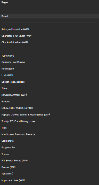
Rather than starting from scratch, I catalogued everything the Lead Artist and their team had already created and slotted it into the taxonomy. I then worked backwards with the Lead Artist - identifying what was inconsistent, what didn't match spec, and what needed to be rebuilt. This respected the team's existing creative output and avoided the resentment of having work discarded.
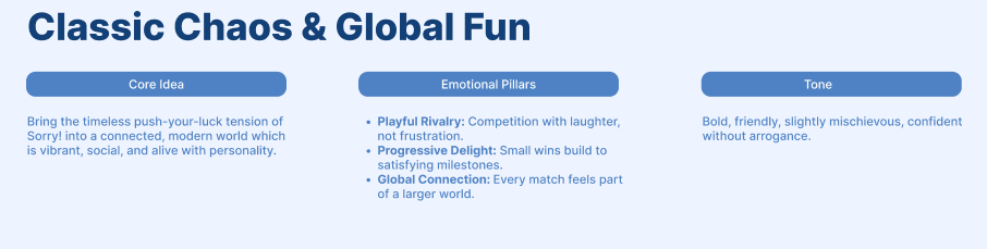
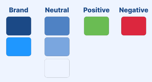
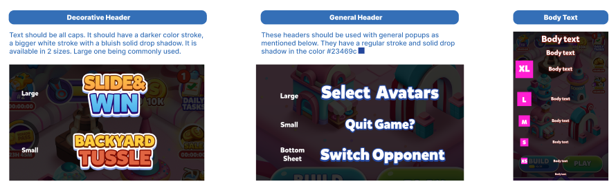
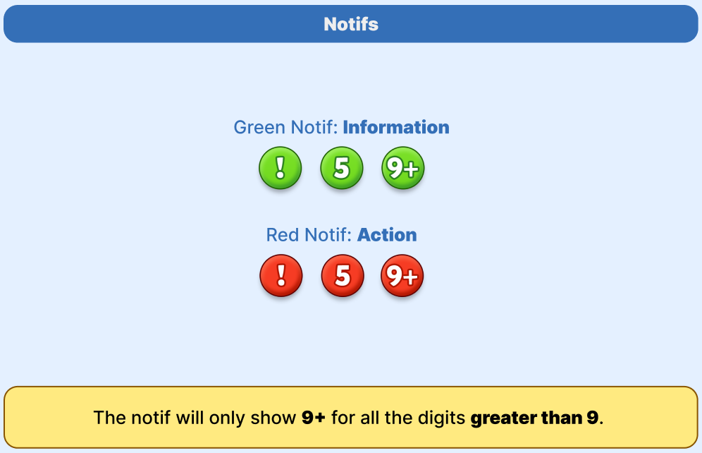
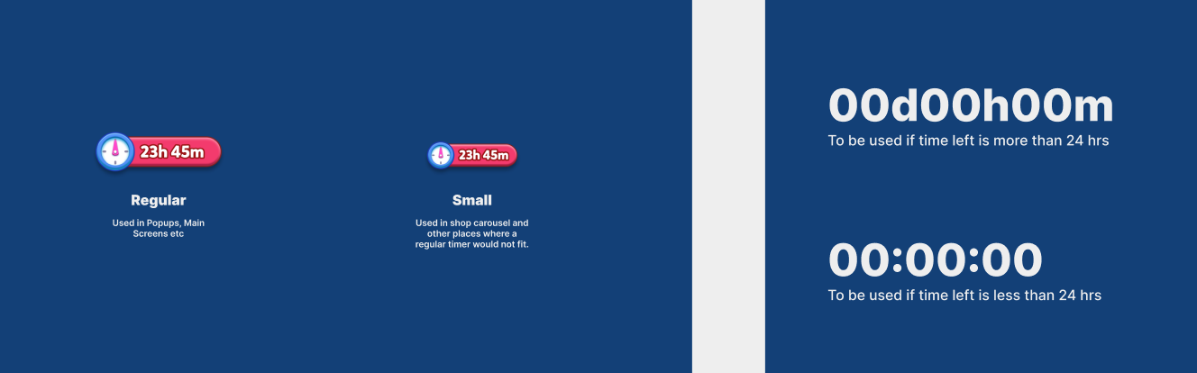
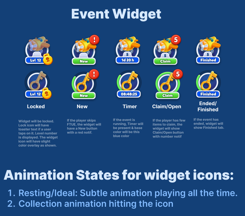
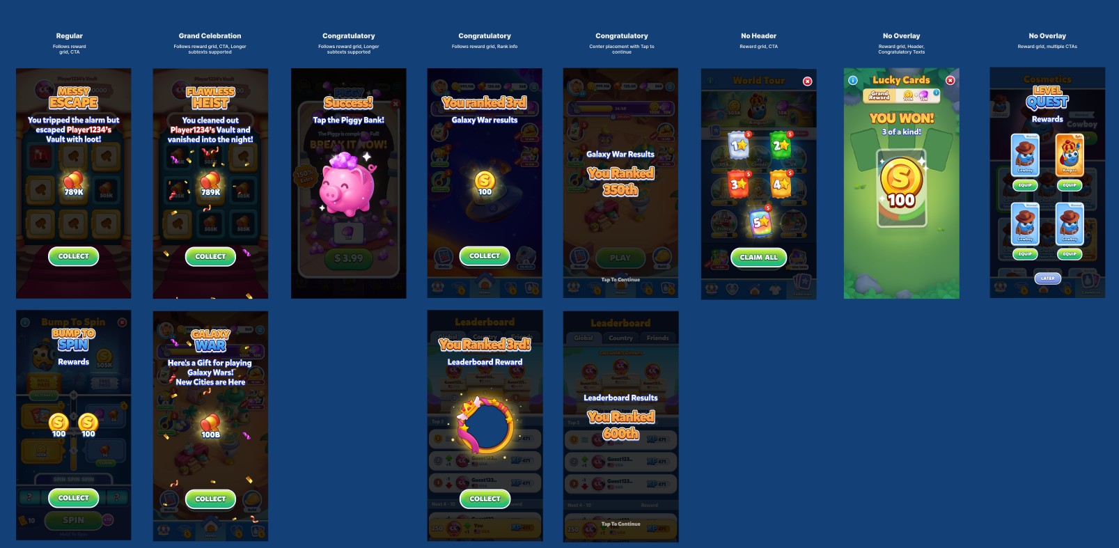
In collaboration with the Lead Technical Designer, every element and component was integrated into Unity - establishing prefabs, style templates, and canonical references. The Lead Developer helped validate that core flows like reward sequences were properly abstracted for reuse. The system had to live where the team actually worked, not sit in a Figma file nobody opened.
The design system shipped and had immediate, measurable effects - on the game itself, and on the team making it.
The game read as a single, intentional product - not a patchwork of disconnected sprints.
Consistent UI patterns reduced friction. Players learned faster and stayed oriented - the system worked invisibly, as good UX should.
Reusable components, prefabs, and standard flows cut implementation and debate time across every discipline.
The Product Manager, who had initially pushed back hardest, was among those who saw the impact most clearly - noting that the parallel investment had paid for itself before the project was even finished.
Presented at the company townhall.
The studio adopted it as the standard for every upcoming game in their portfolio.
What began as a parallel-track effort to serve one title became the studio-wide blueprint for how all future games would be built - a direct outcome of grounding the work in player experience first, earning cross-functional trust, and making the business case legible to a sceptical PM before a single component was designed.
#1 US Playstore Board Game · 1M+ downloads · #7 US Appstore