Increasing Card Collection Engagement in Parchisi Star
Parchise is a popular board game played by two to four players in which each player moves four tokens around a cross-shaped board according to dice rolls, with the goal of moving all their tokens from the starting area to the home space before their opponents.
UX Designer
Parchisi Star
Card Collection
Revenue from card collection was underperforming
Cards in Parchisi Star were earned through playing matches, a passive, in-game reward system. Despite being a core feature, card collection was generating low revenue and had low player interaction.
Before jumping to solutions, the team needed to understand why. Was it a pricing issue? A motivation issue? Or something more fundamental?
Are players choosing not to engage with card collection, or do they not even know it exists?
A survey revealed the real culprit: awareness
A survey was run to measure player awareness of the card collection feature. Responses were segmented into distinct behavioral groups to understand if the problem varied by player type.
The majority of players across segments were unaware that card collection existed as a feature, the problem wasn't motivation to engage, it was discoverability.
Working within tight product and cost boundaries
Two key constraints shaped the solution space from the start.
This meant the team couldn't overhaul the interface or build complex new systems. The solution had to be lightweight, additive, and work within the existing game loop.
A reveal mechanic that made cards feel earned
Rather than silently depositing cards into a collection, the new mechanic introduced a moment of anticipation and action — players received a face-down card at the end of a match, then had to navigate to the card collection screen to flip and reveal it.
- 1
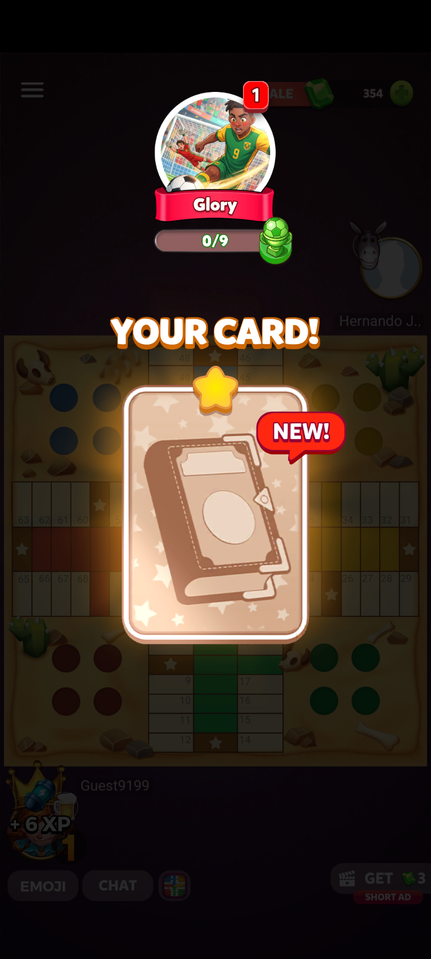
Flipped card awarded post-match
At the end of every match, players received a face-down card — visible but unrevealed. A persistent tooltip appeared whenever a card was available, creating a standing call to action.
- 2
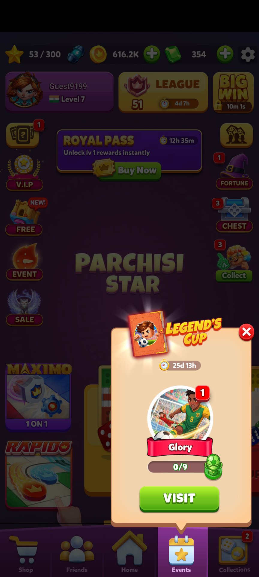
Tooltip taps deep-link to card collection
Tapping the tooltip navigated players directly to the card collection set page, removing the friction of finding the feature independently.
- 3
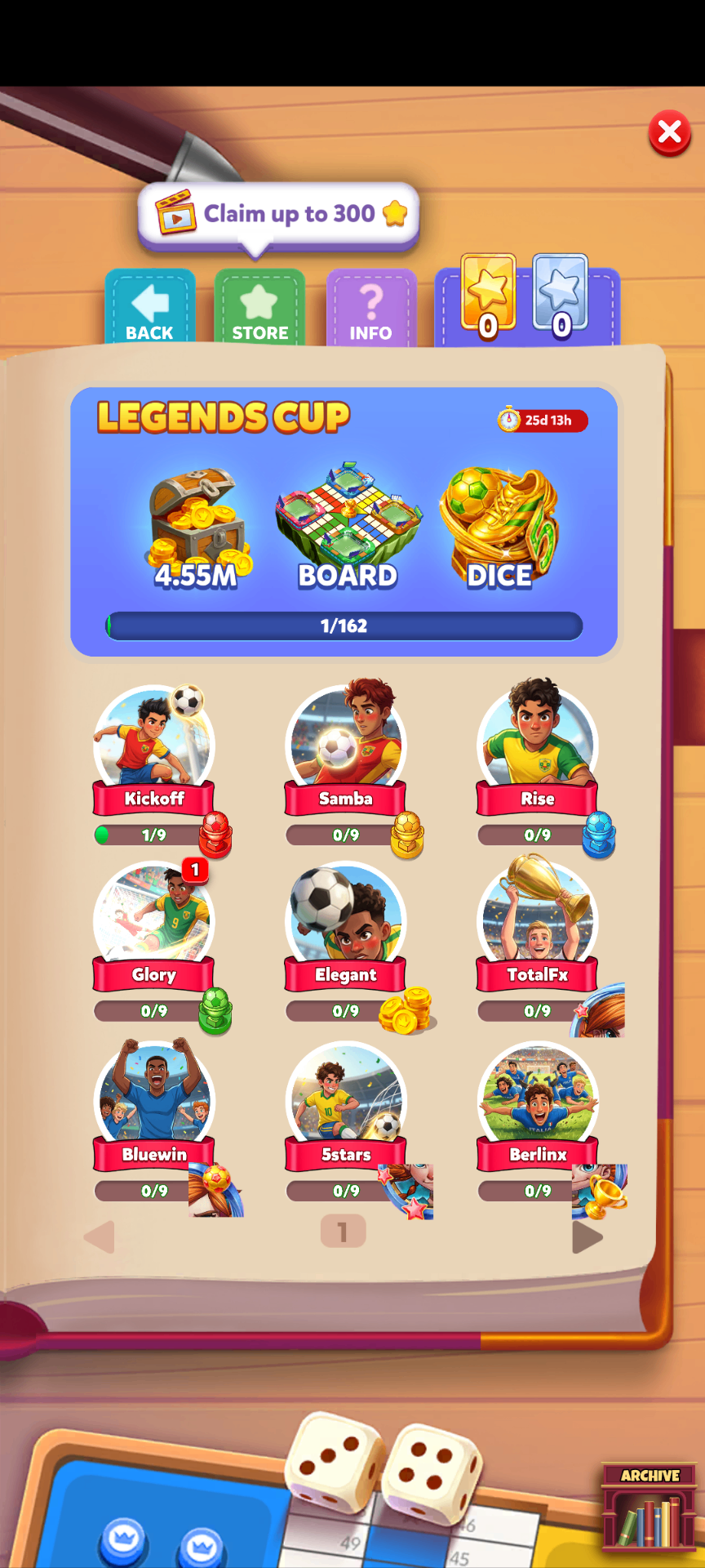
Reveal interaction unlocks reward
Revealing a card triggered a small reward, reinforcing the action with immediate positive feedback and making the card collection feel like a meaningful destination.
- 4
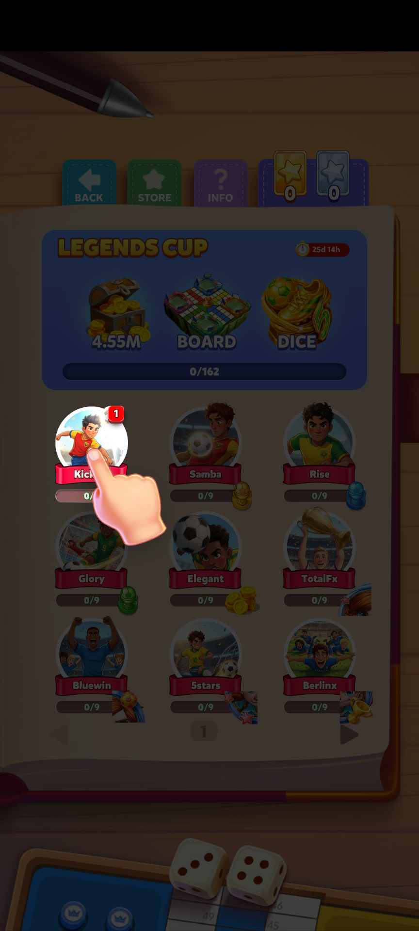
FTUE introduced every new season
A first-time user experience was shown at the start of each card collection season to re-onboard returning players and introduce the feature to new ones — acknowledging that player memory across seasons is short.
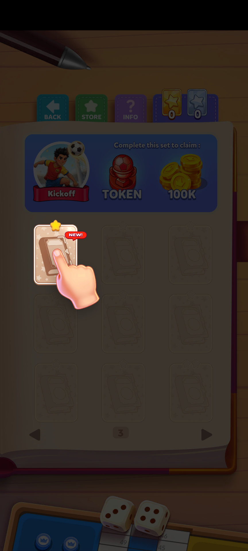
Handling duplicate cards and unrevealed sets
If the awarded card was not new to the player's collection, it is shown as a revealed card.
If players had unrevealed cards at the close of a card collection season, those cards expired without granting their rewards, creating a natural urgency to return and reveal before the deadline.
Engagement and revenue both moved meaningfully
The mechanic succeeded by making an invisible feature visible, not through aggressive notifications or UI overhaul, but by creating a natural reason to visit the feature and a rewarded action once there.
What this project reinforced
Start with awareness before assuming motivation. Low engagement doesn't always mean low interest, research first to distinguish discoverability failures from genuine product problems.
Friction can be a feature. Requiring players to navigate and tap-to-reveal, rather than auto-adding cards, created a micro-moment of engagement that made the reward feel earned.
Constraints focus creativity. Not being able to change the base design pushed the team toward a lightweight contextual entry point rather than a heavier redesign.
Seasons reset memory. Re-running FTUE every season acknowledged a real player behavior pattern, even returning users need re-onboarding after a break.
More than 100M+ downloads