Bringing Hasbro's Sorry! to mobile
This is the story of how a beloved 70-year-old board game became the #1 US Playstore board game, told in seven chapters, from the first brief to the post-launch surprise that made us redesign one of our favourite features.
- Role
- Lead Game UX Designer
- Game
- Hasbro · Sorry World!
- Scope
- Core Game
A 70-year-old board game gets a phone
Hasbro came to us with a deceptively simple ask: take Sorry!, a game families have been playing on the carpet since 1934, and put it in everyone's pocket. The catch? Nothing about the physical game was built for a 6-inch screen, a single thumb, or a five-minute commute.
There had never been a digital Sorry!. Which meant our job wasn't just translation; it was inventing what the digital version of this game even was. Every interaction, from drawing a card to sliding a pawn home, had to be re-imagined for tap accuracy, mobile clarity, and a one-thumb grip.
Mobile-friendly, readable, accessible; portrait, one-handed.
Keep the feel of the original while adapting every interaction for digital play.
Two players, one shared table
Before we touched a single tile, we had to know who would be holding the phone. Almost everything we built later was a negotiation between their two very different reasons for opening the app.

Self-acclaimed "Cool Dad." A devoted family man who constantly tries to find ways to bond with his three kids.
What they want: Grew up bonding with his dad playing Sorry!. Wants to play with his kids during time off. Values the straightforward rules that make it accessible to "some" of his kids.

Middle child of the Dunphy family. Most intelligent; likes to come first in whatever she does.
What they want: Wants a game that's super quick. Likes to challenge herself with strategic elements. Competitive; plays to win and doesn't like slow or unpredictable opponents.
Phil wants nostalgia and a moment with his kids. Alex wants speed and a fair fight. Holding both of them in mind, five player needs kept surfacing in every round of testing:
Instant recognition. The digital board must feel familiar so existing knowledge from the physical game transfers naturally.
Tap-accurate layout. Board, tiles, and pawns must be readable and tappable on mobile without zooming or confusion.
Card clarity. Clearly explain what each card does, especially rare cards like Sorry! and Dual Action.
Delightful moments. Animations, sound cues, and turn effects preserve the fun, tension, and excitement of the board game.
We copied the board. It didn't work.
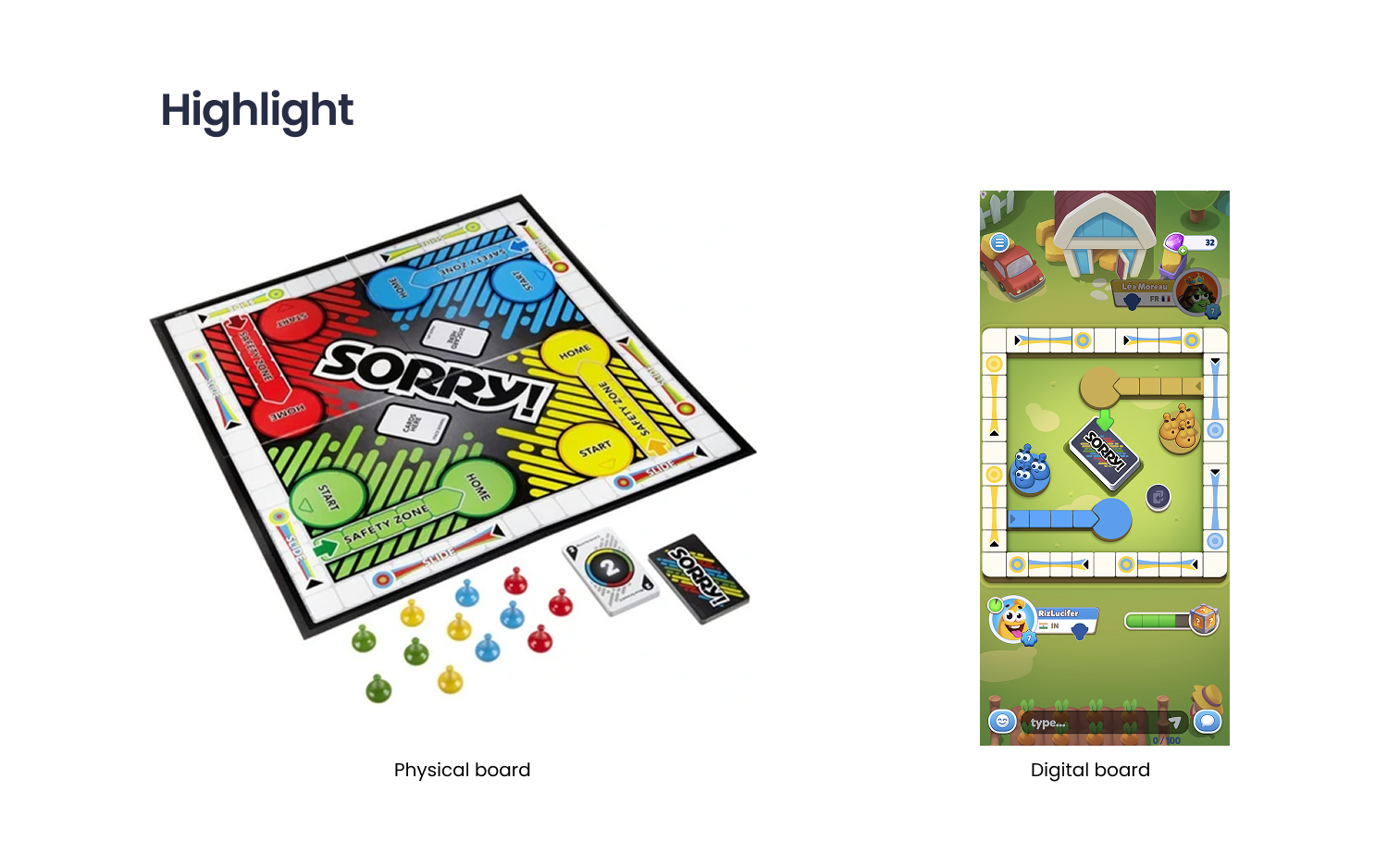
Our first instinct, and the one Hasbro instinctively trusted, was to honour the original: a faithful, 1:1 digital replica of the physical board. Playtesters opened it, smiled at the nostalgia, and then immediately ran into trouble.
The first build was a love letter to the board: identical layout, identical proportions, the same isometric angle that makes the physical game feel like a stage. Players opened it and recognised it instantly.
And then they tried to play. Tiles were too small for a thumb. The isometric view collapsed in portrait. Faithful replication had created visual density that read as clutter, not comfort. The nostalgia opened the door, but the usability slammed it shut.
"The most respectful thing we could do for the original was to stop trying to copy it."
Choosing portrait, and choosing less
We had to make a few brave cuts. Portrait over landscape. Two players over four. Six minutes over forty. Each cut hurt a little, and each one made the game playable.
Landscape needed two hands. People play on the train, in bed, on the couch, with one thumb. Portrait won.
The 4-player game ran ~40 minutes. For a mobile session, we cut it to a head-to-head core loop.
We rebuilt every system around a 5–6 minute session — fewer tiles, no discard pile, faster turns.
Each cut narrowed the product. Each cut also made it possible. A two-player, portrait, six-minute Sorry! was a game we could actually finish designing, and one people could actually finish playing.
Seven obstacles, seven design decisions
Once the shape of the game was right, the real work began: a series of small, stubborn problems that each needed their own answer. None of them were glamorous on their own. Together, they're the whole product.
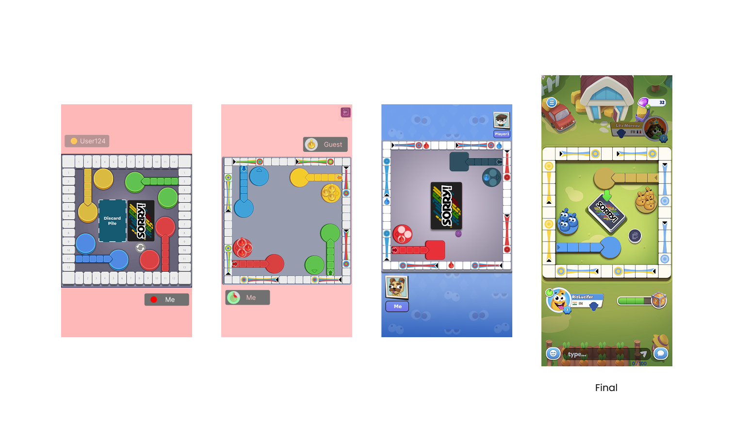
A direct port made tiles too small to tap, the isometric view collapsed on a portrait screen, and the discard pile ate half the board.
We launched 2-player only, removed the discard pile, shrank the tile count for bigger tap targets, differentiated start and home shapes, and quieted the slide colours.
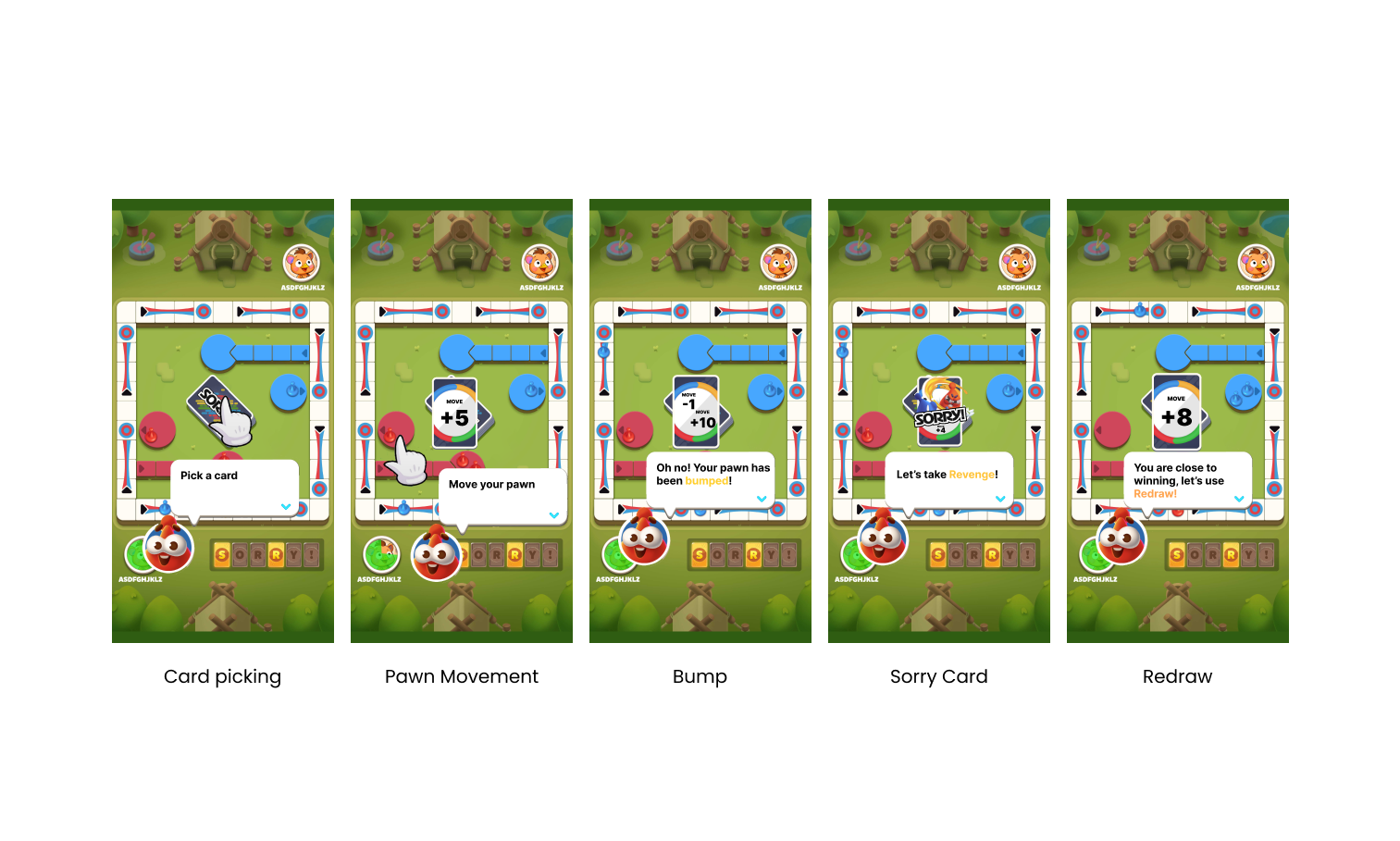
Board-game muscle memory didn't transfer cleanly. Players didn't know where to tap, the card glossary felt dry, and 'redraw' was a brand-new mechanic with no real-world equivalent.
We taught through action rather than text, introduced redraw inside a moment where it genuinely helped, and kept a card-info button for the curious.
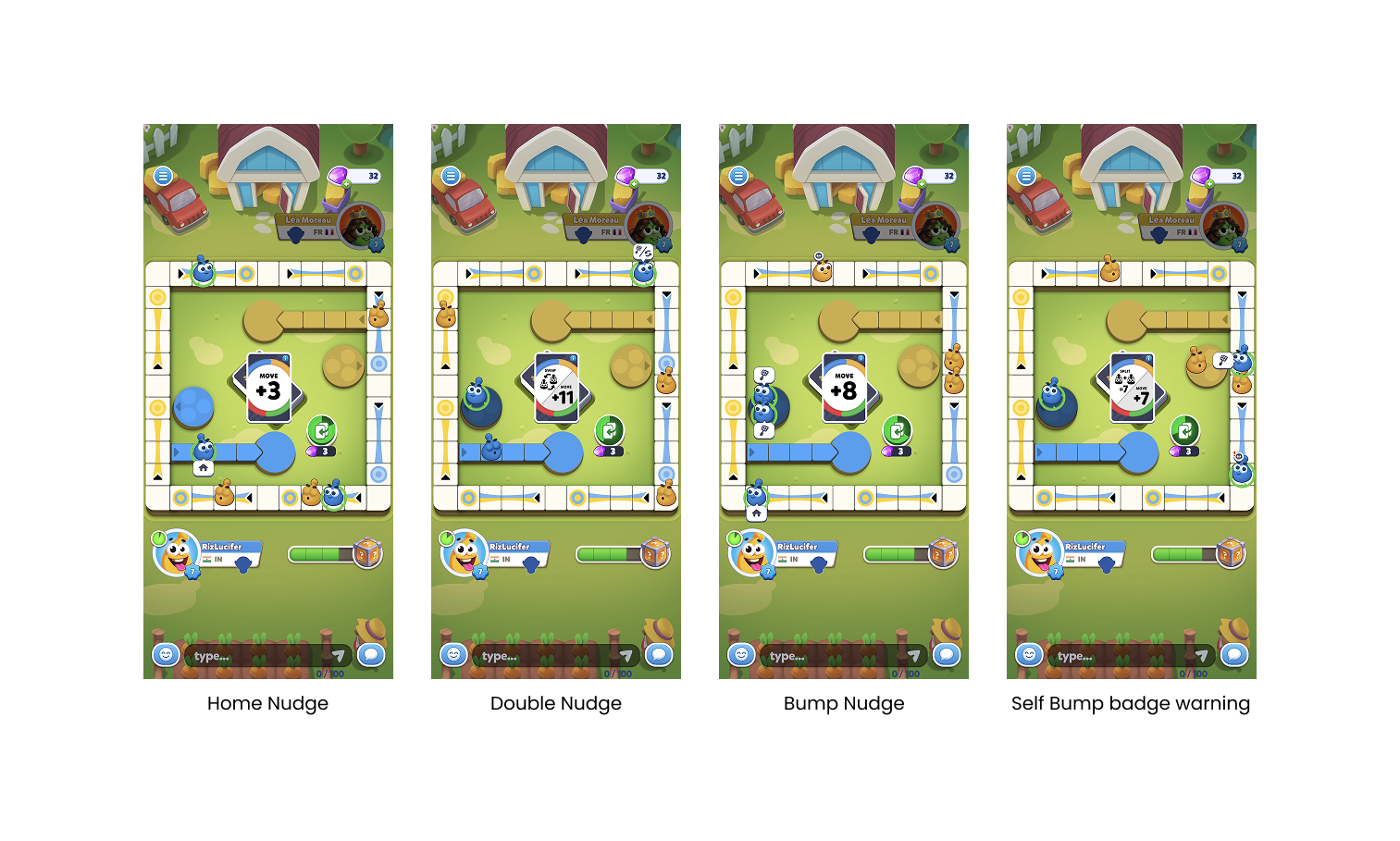
Every turn became a math problem. Sessions ballooned past our six-minute target, and players were accidentally bumping their own pawns on slides.
Contextual nudges highlighted every beneficial action; swap, home, bump, Sorry, with a bump badge on opponents and a warning badge on slides.
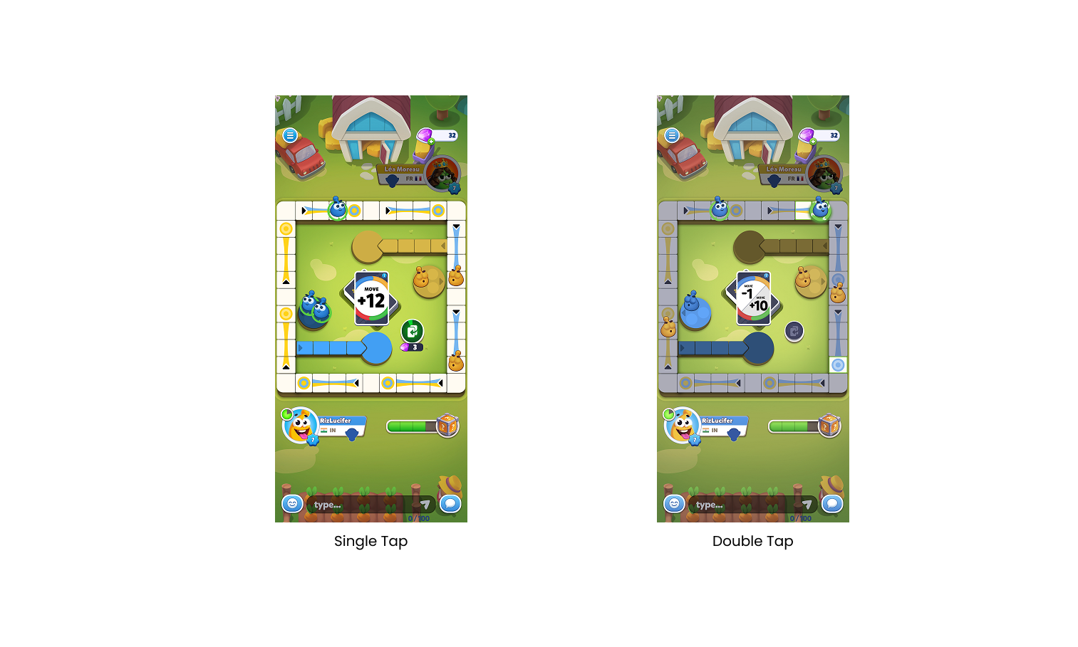
Too many taps and the game crawled. Too few and players lost agency over their own moves.
Single-action cards: one tap and the pawn moves. Dual-action cards: tap the pawn, then tap the destination. Fast where it could be, deliberate where it had to be.
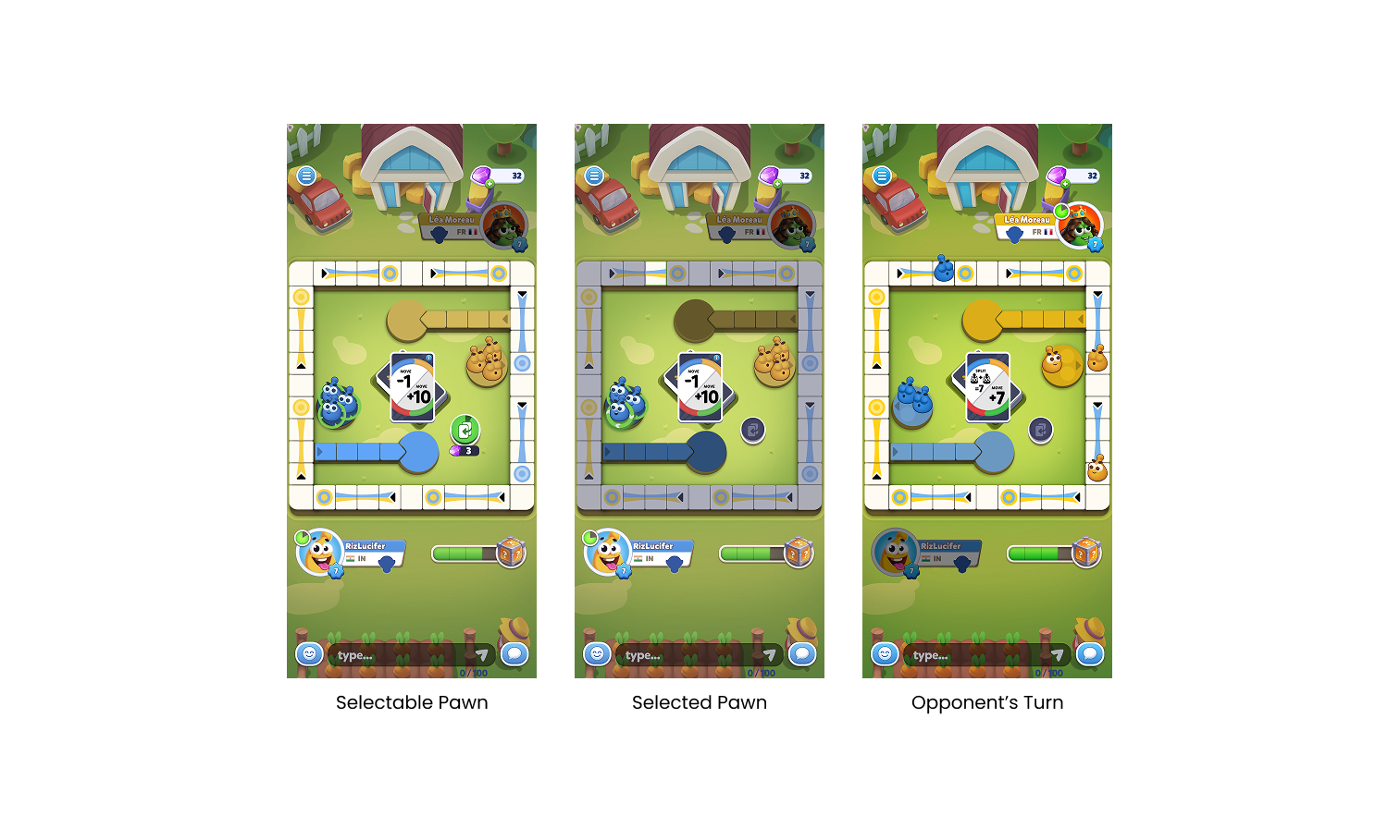
Players regularly lost track of whose turn it was and which pawns they could actually move.
The opponent's lane dims, their pawns close their eyes, and your active pawns open theirs. Selectable, selected, and idle states all look distinct, and inactive pawns wiggle when poked.
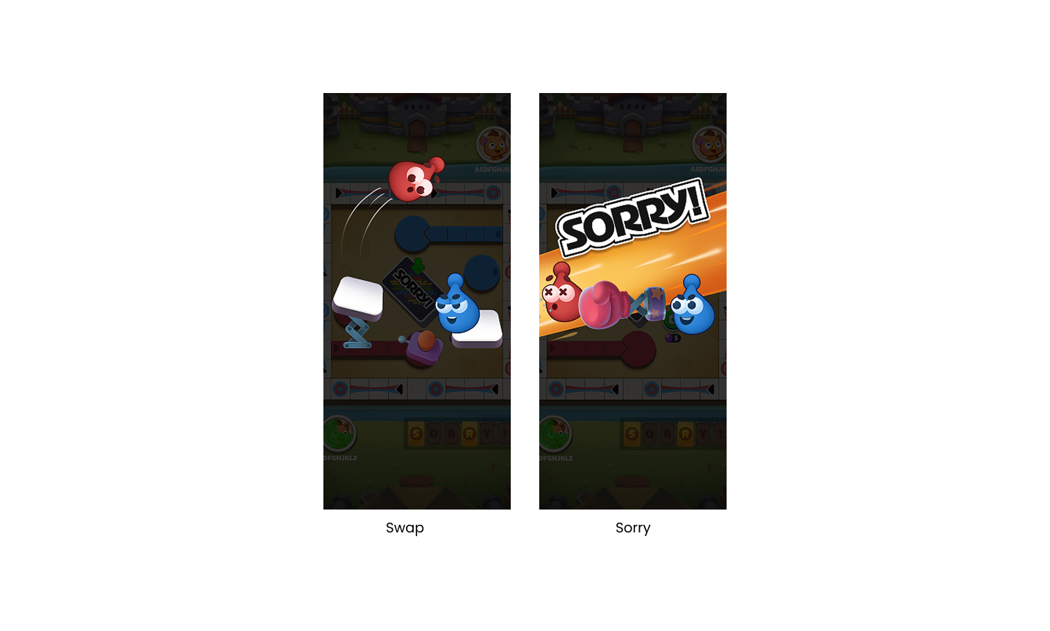
Sorry! lives or dies on its biggest moments; the swap, the Sorry card. On cardboard those are loud. On glass, they were silent.
Custom on-board animations, full-screen overlays with dynamic pawn colours, and the nostalgic 'Sorry!' voice cue, engineered to land the same dopamine hit.
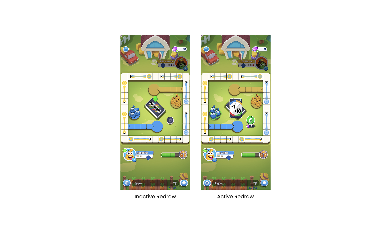
Redraw is unique to digital. We needed it to feel like a generous tool, not a pay-to-win trap.
The first redraw is FTUE-guided so players feel the value before they're ever asked to spend. The nudge system makes the upside of redrawing visible in the moment.
Launch revealed something we hadn't seen
Shipping wasn't the end of the story. Watching real players in the wild surfaced a behaviour our playtests had missed, and forced us to revisit a system we thought we'd finished.
We were proud of the nudge system. It pointed players to the best move on the board: a swap here, a Sorry! there, a bump waiting to happen. In playtests it felt like having a friend lean over your shoulder.
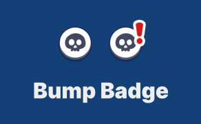
Then real players started doing something our playtests never quite caught: the nudges were so persuasive that players followed them into self-kills on slides. bumping their own pawns home, undoing their own progress.
We shipped a fix: a small exclamation badge on slides that would cost the player their own pawn. The takeaway became a principle we kept after this project a good nudge shows opportunity; a great one also shows risk.
From cardboard to the top of the charts
A year of difficult cuts, hundreds of playtests, and one post-launch fix later, Sorry! World found its audience.
- →Turns completed faster across every player type we tested.
- →Players started recognising the Sorry! card as a true special moment.
- →Nudges became something players actively relied on, not ignored.
- →Redraw usage climbed after the FTUE-guided introduction.
- →The post-launch self-kill badge measurably reduced accidental own-pawn eliminations.
#1 US Playstore Board Game · 1M+ downloads · #7 US Appstore